The Flexbox Holy Albatross
For the last 6 or so months, I've been engaged in a number of activities including (but not limited to):
- Scratching my head
- Staring out of the window
- Laying in bed and staring at the ceiling
- Screaming into a pillow
- Rolling around on the floor sweating feverishly while muttering archaic and forbidden incantations
Coincidentally, I've been spending this same time period trying to solve a particularly vexing CSS layout problem. You might say the problem has become both my albatross and my Holy Grail; my Holy Albatross, if you will.
At 5am this morning, through the fug of a Tiny Rebel Stay Puft Marshmallow Porter™ hangover, the solution struck me. And now I'm going to share it with you.
The problem
With Flexbox you can combine wrapping (flex-wrap: wrap) and growing (flex-grow: 1) to ensure all flex items fall into their rightful place across different viewport widths. Flexbox can create an effortlessly responsive layout with no collisions or unseemly gaps in sight.
The trouble is, sometimes you want your items to wrap in a very particular way. For instance, when you have three items, you'll be happy with the three-abreast layout and accepting of the single-column configuration. But you might like to avoid the intermediary part where you get a pair of elements on one line followed by a longer element underneath.

Why? Well, when you have a set of three equivalent items and one is displayed differently it looks deliberate — like you consider the third item special and want the user to perceive it that way. It's bigger; does that mean it's better? Or more important?
But never mind the whys and wherefores. How do we skip this intermediary layout state and switch directly from a horizontal to vertical triptych? What's the solution?
Use a media query, silly
No, I don't want to. In fact, I outright refuse to. And it's not just because I'm self-conscious about writing the cleanest and cleverest code. It's because @media breakpoints are anathema to design systems. My component, defined outside of context, could be instantiated within a container/parent element of any width. Context is variable, but all @media queries can do is adjust things according to the constant that is the viewport.
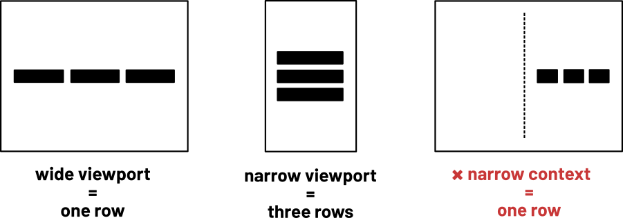
Useless, actually. And that's why so many people have been writing and fighting and conspiring for container queries: breakpoints that correspond to the immediate container element instead of the viewport.
The trouble is, container queries ask a lot from browsers and nobody's come up with a native CSS solution that would be acceptably performant. Soooooo… JavaScript?
JavaScript all the things
Using ResizeObserver you can spawn element/container queries with very little code. I spun this little module up earlier this morning; you can have it.
export default function markBreak(elem, width) {
  if (ResizeObserver) {
    const test = document.createElement('div');
    test.classList.add('test');
    test.style.width = width;
    elem.appendChild(test);
    let br = test.offsetWidth;
    elem.removeChild(test);

    const ro = new ResizeObserver( entries => {
      for (let entry of entries) {
        const cr = entry.contentRect;
        const q = cr.width <= br;
        entry.target.classList.toggle('lt-' + width, q);
        entry.target.classList.toggle('gte-' + width, !q);
      }
    });

    ro.observe(elem);
  }
}
(There's a great intro to ResizeObserver by Surma.)
If I wanted my triptych to become a vertical column from 40rem, I'd just execute markBreak(container, '40rem') and write this CSS:
.container > * {
  width: 100%;
}

.container.gte-40rem > * {
  width: 33%;
}
Not bad because:
ResizeObserveris optimized for efficiency. Much less janky than usingonresizeor some such horror- It's a progressive enhancement: if JavaScript doesn't run, or
ResizeObserverisn't supported, the user gets a perfectly adequate single column configuration regardless of the container width. - The
testelement lets you choose a breakpoint using any unit. '20em' would be accurate because the relative dimension is translated to pixels for the current context (20rem could mean something else entirely elsewhere in the page).
But actually it's quite bad because:
- JavaScript may well not run, and is always relatively intensive when it does. And it makes you bleed profusely from your anus.
ResizeObserveris currently only supported in Chrome and *checks notes* Opera for desktop.
So is there a CSS-only solution? Yes, there is (well, HTML and CSS to be honest). I hope you like custom properties and the calc() function.
Solved with CSS
HOLD YOUR HORSES! I now have a MUCH SMARTER solution using just flex-basis, meaning any number of horizontal elements can be switched to a vertical configuration. This will probably suit you better. See The Flexbox Holy Albatross Reincarnated.
Let's break this down. I want my component to be flexible; to grow and shrink. However, I only want the items to take up either 33% or 100% of the container/parent element's width. The easy part is ensuring the elements never take up less than 33% or more than 100%:
.container > * {
  min-width: 33%;
  max-width: 100%;
  flex-grow: 1;
}
(The flex-grow part is really just because I can't be bothered to write out 33.33333333333%. It makes sure each column distributes to take up exactly one third of the space.)
The flex-basis property sets the basic/initial width for any item. Items can still grow and shrink from the flex-basis value where there's room. Critically, min-width and max-width override flex-basis. So if the flex-basis value is absurdly high, like 999rem, the width will fall back to 100%. If it's absurdly low, like -999rem, it'll default to 33% (or 33.333333333333% thanks to flex-grow).

The key is making this switch at the desired point. For argument's sake, this point will be 40rem. At below 40rem, the items will be on one row. At 40rem and above, they'll each have their own row.
On the container, I set a custom property, --multiplier:
.container {
  display: flex;
  flex-wrap: wrap;
  --multiplier: calc(40rem - 100%);
}
That's right: the calculated value will be negative if the container is 40rem or more and positive if it's narrower than 40rem. On the flex items we use this as a multiplier, setting our absurdly high or absurdly low flex-basis value. 999 is customary in these situations.
.container > * {
  min-width: 33%;
  max-width: 100%;
  flex-grow: 1;
  flex-basis: calc(var(--multiplier) * 999);
}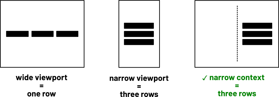
And that is that.
Edit: As Snook points out in his follow-up post, the custom property isn't needed. I should have explained you can just include the value as part of the child element's calc. Why? Because 100% is the same for the parent and the child. However, I like to name and set this value with the container, for readability. It's also neat how dynamic custom property values are automatically inherited. There might be more wild things can be done with that.
Unless you want margins. You can use the negative margin hack (as demonstrated in my video) to keep things flush, but you need to remove the margin from the min-width value to make sure things still 'switch' where they're supposed to:
.container {
  display: flex;
  flex-wrap: wrap;
  --margin: 1rem;
  --multiplier: calc(40rem - 100%);
  margin: calc(var(--margin) * -1); /* excess margin removed */
}

.container > * {
  min-width: calc(33% - (var(--margin) * 2)); /* remove from both sides */
  max-width: 100%;
  flex-grow: 1;
  flex-basis: calc(var(--multiplier) * 999);
  margin: var(--margin);
}
(This will become redundant when the gap property is more widely supported. Think grid-gap but for Grid, Flexbox, and other contexts.)
It can also work with different numbers of elements and elements of different widths. For example, given four elements, you may want the odd ones to be 20% and the even ones 30% above 60rem. Here's Flexbox, custom properties, calc(), and nth-child all working nicely together:
.container {
  display: flex;
  flex-wrap: wrap;
  --margin: 1rem;
  --multiplier: calc(60rem - 100%);
  margin: calc(var(--margin) * -1);
}

.container > * {
  max-width: 100%;
  flex-grow: 1;
  flex-basis: calc(var(--multiplier) * 999);
  margin: var(--margin);
}

.container > :nth-child(2n - 1) {
  min-width: calc(20% - (var(--margin) * 2));
}

.container > :nth-child(2n) {
  min-width: calc(30% - (var(--margin) * 2));
(Note the use of * and the cascade here, so not to redundantly repeat shared declarations. The older CSS stuff still pulls its weight!)
Here is a demo of the basic version in CodePen. If you want to learn more about algorithmic layouts for the web, I have a video you might like. See also The Fab Four technique which, as was pointed out to me, arrives at a very similar solution, except with width in place of flex-basis.