Tetris And The Power Of CSS
To be really good at CSS, you have to learn CSS. I know this sounds like a tautology but I've become aware of a peculiar attitude that preprocessors such as SASS are somehow successors to CSS. Some SASS and LESS nerds are fond of proliferating the following aphorism. It should be noted that its author did not himself intend it as an advocation of preprocessors.
The four stages of CSS: 1. I don’t know CSS 2. I know enough CSS to get by 3. I _know_ CSS 4. Fuck CSS
They forget that all preprocessors do is make writing CSS easier, not qualitatively different: It's still CSS that comes out of the end. This is a shame, because vanilla CSS deserves some credit for being a powerful, rule-based language all its own and — when it comes to solving the kind of design problem I shall be exploring in this post — it doesn't matter how you "preprocess" the CSS; it's the naked CSS logic that does the heavy lifting.
Put down your classes, ladies and gentlemen, because we're talking about dynamic content and they cannot save you now.
Incomplete grids
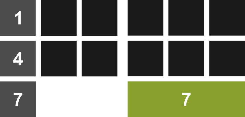
Let's imagine we have a three-column grid but that we don't know how many items will be in that grid. Perhaps items expire over time or users are able to delete them from the list. To fit a three-per-line formation, each item must be floated left and have a width of 33.333%. Okay… so let's say we arrive at the page and there are 7 active items. Visually, it's going to look like this:
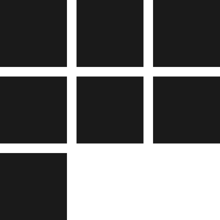
Now, I'm the sort of designer who couldn't give a toss about "pixel perfection" so long as the page is usable and accessible. That said, this kind of blatant asymmetry is a bit jarring, even to me. What I need is a way to treat that last item — the orphan — differently. I'm sticking to the Tetris analogy, so I'd like to make that last item a full row (full width) and earn myself some points. (I know you can't change the width of blocks in Tetris; I'm just talking about making tidy rows, alright?)
We could do this by adding some logic to the template and writing a last class to whichever item comes last. However, we all know too much template logic is bad, especially when it breaks with the separation of concerns rule. That is, the last class would only denote visual — not structural — differentiation. Not only that but, if the user deletes an item, we'll have to dynamically rewrite the DOM to replace the last class on a new item with javascript. Poo to that!
The simplest and most efficient way to deal with this is to use the (very well supported) :last-child pseudo-class:
.grid li:last-child {
   float: none;
   width: auto;
}
We have a problem
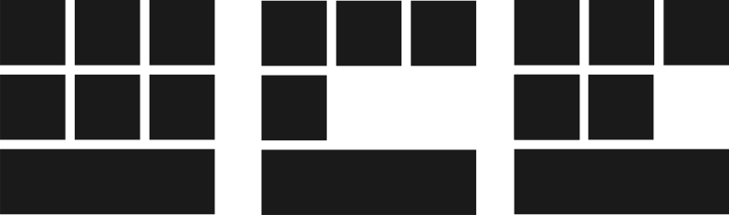
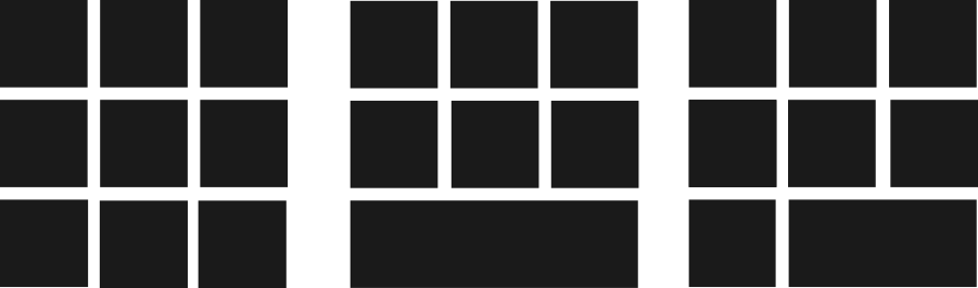
So far, our technique is incomplete. Why? Because, so far we haven't incorporated any logic to determine whether our last item is, in fact, an orphan. This means that about 33.33% of the time we're going to make our grid prettier, but approximately 66.66% of the time we're actually going to make our grid uglier:
To fix this problem we need to leverage some of the CSS power you didn't learn while dicking about with SASS. Well, maybe you did, but in spite of SASS; not because of it. We're going to have to incorporate some maths, so let's consider the axioms:
- The grid is three items wide
- The grid contains any number of items
- Orphans are last items
- Orphans exist alone, on their own row
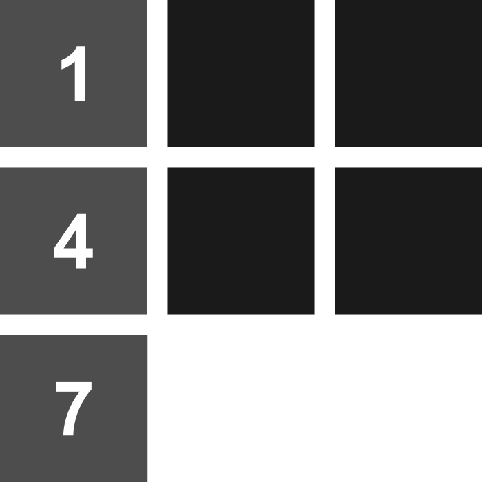
If you look at which item numbers correspond to potential orphans (items that would be orphans if they were the last items), the first thing you'll notice is that the list begins with "1": We don't want a single item, all on its own, to appear at 33.333% width. That would be weird. Counting up, 4, 7, 10, 13, 16 follow 1 as potential orphans. The interval, you will notice, is three. In other words, if you minus 1 from each value, you're looking at the three times table. Now we're getting somewhere.
This is where CSS's spectacularly useful :nth-child pseudo-class comes in. Since :nth-child can accept algorithmic arguments, we can predict and target potential orphans ad infinitum.
li:nth-child(3n + 1) {
   /* Selector not complete, so no rules yet. */
}
If, like me, you're not familiar with mathematical syntax, the 3n part just means 3 x n. The algorithm does this for values of n going up in integers (0, 1, 2, 3, etc. etc. etc.). So, 3n + 1 is first equivalent to 3 x 0 + 1, which equals 1. Then it's equivalent to 3 x 1 + 1, which is 4. That's the pattern we want, but our selector isn't finished quite yet.
(For a more detailed explanation of :nth-child, consult "Lord Of The Hootenanny", Chris Coyier's 2010 post).
Potential orphans and actual orphans
This is the part I love. This is the part where the modular logic of CSS comes into play. So far we've only identified potential orphans. That is, our selector only anticipates one of two conditions that must both be true for the targeted item to be a true orphan. The original condition that an orphan must be a :last-child is still true, so we must concatenate our two conditions in one selector chain like so:
li:nth-child(3n + 1):last-child {
   /* Now you are safe to do some orphan styling */
   float: none;
   width: auto;
}
Note how the logic is similar to a more typically programmy programming language. It's a bit like saying:
foreach (items as item) {
	if (item.condition1() && item.condition2()) {
		item.adopt();
	}
}
Of course, making the orphan "full width" is just to satisfy my tenuous Tetris analogy. Instead, you could bring the orphan neatly into the center.
li:nth-child(3n + 1):last-child {
   float: none;
   margin-left: auto;
   margin-right: auto;
}
Off by one
What if we also want to target last items that appear in the second column (or last items in 3-column grids which have a single gap at the bottom right position)? We simply copy/paste our selector and jog the algorithm on one integer to read 3n + 2. Now we can use the two selectors in tandem to ensure no gaps appear in our grid under any circumstances. No template logic or javascript DOM manipulation required.
li:nth-child(3n + 1):last-child {
   float: none;
   width: auto;
}

li:nth-child(3n + 2):last-child {
	width: 66.666%;
}
Did you think I was actually going to recreate Tetris in CSS? Sorry, no. Nobody needs to do that.
Update
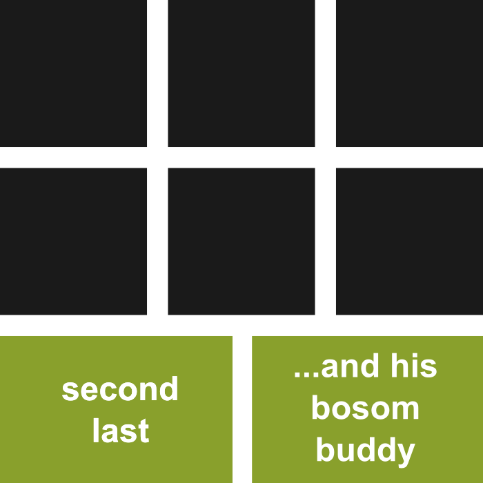
This update is dedicated to Aditya Raisinghani who left a comment with the great idea of incorporating nth-last-child(2) to make the last two items each 50% width.
How are we going to do this? The logic states, "if the second last item falls in the first column, make it and the one after it 50% width to fill the row".
In the following snippet, I am going to combine Aditya's selector with an adjacent sibling combinator to fulfill the "one after it" part. We could, of course, use 3n + 2 again, but I prefer the way this reads.
li:nth-child(3n + 1):nth-last-child(2),
li:nth-child(3n + 1):nth-last-child(2) + li {
   width: 50%;
}