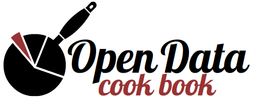
An Open Data Logo
I was recently asked to design a logo for the Open Data Cookbook; a marvellous organisation commited to helping us make use of all the open data (partcularly government data) that has become available. Their excellent wiki provides 'recipes' for sourcing, preparing, fusing and visualising data and is really worth a look.
In the interest (and on the theme) of openness - I thought I'd describe the design process that led to the logo itself. Since the remainder of this article will address graphic design and typography, there may be little of interest for data wranglers and/or evangelists. If you are one of these people, I would quite understand if you wanted to work on your recipes instead.

Marrying the concepts of 'data' and 'cooking' seemed fun - and fairly straightforward - at first, but logo design is more about avoiding negative connotations than confirming positive ones. Unwisely, my first iteration involved knives. It's always risky to put knives in a logo (even for a butcher) but I was keen on the idea of 'incisiveness'.
knives… incisions… incisiveness… clarity… clarity of data
So went the train of thought. Also, I thought I could line up differently sized knives like bars in a bar chart. However, the violence that a knife can't help but signify — as well as many more complex negative notions such as the tyrannical chef — make it unweildy at best.
My second (and last) iteration derived from the simple fortune that the shape of a pie chart and the shape of a frying pan are similarly round. Disregarding the typography, the logo is essentially a pie chart with a pan handle. The flesh-coloured 'sector' is supposed to represent the pertinent data (the meaty part) that might be interesting to scrutinise.
Meat, pies etc. to one side, I think it is the typeface that really makes the design work. The font is called 'Lobster' and it is available - suitably - in the Open Type Format. Not only does it boast seventy nine ligatures (making it one of the most convincing 'script' fonts available) but it is one of the best named fonts, having the perculiar ability to evoke the typography you might expect on a friendly seafood restaurant's menu. That is not to say that the font isn't versatile; it would be my first choice for retro poster designs for a start.
The foundry (headed by Paulo Impallari) has a web page dedicated to the font and it is also available as an @font-face kit from Font Squirrel. The Impallari page is superior because it has a picture of a man in a lobster suit. I hope the foundry doesn't mind me reproducing this image below:
[removed]