A Minute Of Listening
I recently had the privilege of working on a project promoting listening skills amongst primary school children, conceived and curated by Sound & Music and called A Minute of Listening. The project required a desktop application (to be built by NeonTribe) that would be run by a teacher, in front of a class, which played a different 'mystery sound' each time it was powered up. A discussion about the sound would ensue, followed by a reveal (on a further screen) about the sound's origin and recordist/composer. Read a full description on the Sound & Music website or - better still - take a look at the official promo video (I held the boom mic for some of it!).
Although I was involved in coding the interface design (which required some unusual CSS and javascript hacks which I may discuss in another post) it is my work on the artwork and the overall aesthetic of the application that'd I'd like to talk about here.
To begin with, I chose to avoid colour because I was concerned it would prejudice the way the sounds were heard. However, this led to some pretty dry initial designs. As the project progressed, we decided that the actual listening part of the classroom ritual would be fulfilled with the children's eyes closed and I set about making a bold design incorporating flourescent colours and thick, uneven black lines - like the sort made by a marker pen. This resulted in the winning design and the following logo, made with the fantastic Folk font:
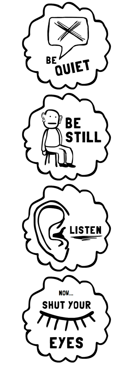
I had the most fun creating the following instructive messages. These appear in order once the teacher has pressed the big play button and are intended to settle and prepare the class for the exercise. It should be noted that I originally 'forgot' to include the sitting character's ears (stylised them into nonexistence, to be more exact) which was a pretty stupid error given the subject matter. I think I overcompensated by making the ears unnaturally large in the final iteration...