Font Hacking
What if I told you there was a way to radically alter your web pages without using images, javascript, proprietary CSS3 or any extra markup? What if I told you you didn't have to be an experienced typographer, you could do it for little more than 6Kb and that it would work in Internet Explorer 7? For free? Welcome to Font Hacking, my primer on extracting, deconstructing, altering and replacing letterforms. The workflow I shall be outlining can be used for good or for evil; artfully resculpting typefaces or brutally defacing them. I am going to give you the ability to do either.
Javascript Is For Losers
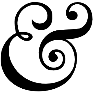
Granular control of web type is often made the responsibility of jQuery, which can yield some interesting results but is rather unwieldy. For instance, let's imagine I wanted to switch the font family of each ampersand throughout a page's worth of flow text. Taking the javascript route, I'd have to locate ampersands in each text node, replace each instance of "&" with <span class="ampersand-font"></span> then write the manipulated string back into … I've just lost the will to live. Not only is the javascript routine cumbersome, but we could be pulling in another whole webfont — which could far exceed 100K in size — just to sate our shameful ampersand fetish.
Unicode Ranges?
Forgetting javascript, one might be attracted to the unicode-range property. You can supply unicode-range to @font-face blocks to hand pick the characters and character ranges that should be within the font's remit. Drew McLellan of Perch even wrote a 24 Ways post on the subject.
There are a couple of major problems with this technique. Firstly, Firefox still doesn't seem to support the attribute. In fact, the last comment at bugzilla.mozilla.org simply reads, "please fix this!" Even with the bug fixed, the necessity of loading a whole webfont just to cover a few characters remains. All the more reason why …
Subsetting Is For Winners
Subsetting is the practise of making a typeface from a subset of another typeface's character set. By eliminating all but the ampersand from a comprehensive character set we can create a new font hundreds of times smaller. This is a good thing. However, the real magic happens when we combine subsetting with font stacks, like so:
body {
   font-family: Ampersand, Georgia, serif;
}
According to the law of font stacks, all characters not supported by "Ampersand" will defer to Georgia. No spans, no classes, no flaky properties, no javascript; just effortless inheritance. In addition, because the ampersand font we're incorporating is so small, there's no reason not to embed it directly into our CSS with a data URI, saving ourselves the server request. The following output is what my ampersand looks like in Base64. It engorges its parent stylesheet by approximately 2.5K. Much worse things could happen, frankly.
AAEAAAARAQAABAAQRkZUTWbVtj0AAAEcAAAAHEdERUYAQAAEAAABOAAAACBPUy8yYeBHpAAAAVgAAABWY21hcMOvhOoAAAGwAAABemN2dCAFEQBEAAADLAAAAAZmcGdtU7QvpwAAAzQAAAJlZ2FzcAAAABAAAAWcAAAACGdseWbl0eOIAAAFpAAAA9hoZWFk/09fwQAACXwAAAA2aGhlYQt6Bc4AAAm0AAAAJGhtdHg0PgBuAAAJ2AAAAExsb2NhDqIPgAAACiQAAAAobWF4cAEtAQIAAApMAAAAIG5hbWUVIDGDAAAKbAAAAURwb3N0M4geUwAAC7AAAADHcHJlcLDyKxQAAAx4AAAALndlYmZZ81EmAAAMqAAAAAYAAAABAAAAAMw9os8AAAAAzUwI/AAAAADNTApxAAEAAAAOAAAAGAAAAAAAAgABAAEAEgABAAQAAAACAAAAAQLMAZAABQAEBTIFmAAAAR4FMgWYAAAD1gBmAhIAAAIABQkAAAAAAAAAAAABAAAAAAAAAAAAAAAAUGZFZABAAA3gAAZm/mYAAAX0ADoAAAABAAAAAAAAAAAAAwAAAAMAAAAcAAEAAAAAAHQAAwABAAAAHAAEAFgAAAASABAAAwACAAAADQAmAD8gCiAvIF/gAP//AAAAAAANACYAPyAAIC8gX+AA//8AAf/1/93/xeAF3+HfsiASAAEAAAAAAAAAAAAAAAAAAAAAAAAAAAEGAAABAAAAAAAAAAECAAAAAgAAAAAAAAAAAAAAAAAAAAEAAAAAAAAAAAMAAAAAAAAAAAAAAAAAAAAAAAAAAAAAAAAEAAAAAAAAAAAAAAAAAAAAAAAAAAAAAAAAAAAAAAAAAAAAAAAAAAAAAAAAAAAAAAAAAAAAAAAAAAAAAAAAAAAAAAAAAAAAAAAAAAAAAAAAAAAAAAAAAAAAAAAAAAAAAAAAAAAAAAAAAAAAAAAAAAAAAAAAAAAAAAAAAAAAAAAAAAAAAAAAAAAAAAAAAAAAAAAAAAAAAAAAAAAAAAAAAAAAAAAAAAAAAAAAAAAAAAAAAAAAAAAAAAAAAAAAAAAAAAAAAAAAAABEBREAALAALLAAE0uwTFBYsEp2WbAAIz8YsAYrWD1ZS7BMUFh9WSDUsAETLhgtsAEsINqwDCstsAIsS1JYRSNZIS2wAyxpGCCwQFBYIbBAWS2wBCywBitYISMheljdG81ZG0tSWFj9G+1ZGyMhsAUrWLBGdllY3RvNWVlZGC2wBSwNXFotsAYssSIBiFBYsCCIXFwbsABZLbAHLLEkAYhQWLBAiFxcG7AAWS2wCCwSESA5Ly2wCSwgfbAGK1jEG81ZILADJUkjILAEJkqwAFBYimWKYSCwAFBYOBshIVkbiophILAAUlg4GyEhWVkYLbAKLLAGK1ghEBsQIVktsAssINKwDCstsAwsIC+wBytcWCAgRyNGYWogWCBkYjgbISFZGyFZLbANLBIRICA5LyCKIEeKRmEjiiCKI0qwAFBYI7AAUliwQDgbIVkbI7AAUFiwQGU4GyFZWS2wDiywBitYPdYYISEbINaKS1JYIIojSSCwAFVYOBshIVkbISFZWS2wDywjINYgL7AHK1xYIyBYS1MbIbABWViKsAQmSSOKIyCKSYojYTgbISEhIVkbISEhISFZLbAQLCDasBIrLbARLCDSsBIrLbASLCAvsAcrXFggIEcjRmFqiiBHI0YjYWpgIFggZGI4GyEhWRshIVktsBMsIIogiocgsAMlSmQjigewIFBYPBvAWS2wFCyzAEABQEJCAUu4EABjAEu4EABjIIogilVYIIogilJYI2IgsAAjQhtiILABI0JZILBAUliyACAAQ2NCsgEgAUNjQrAgY7AZZRwhWRshIVktsBUssAFDYyOwAENjIy0AAAAAAQAB//8ADwACAEQAAAJkBVUAAwAHAC6xAQAvPLIHBAHtMrEGBdw8sgMCAe0yALEDAC88sgUEAe0ysgcGAvw8sgECAe0yMxEhESUhESFEAiD+JAGY/mgFVfqrRATNAAAAAgAcAAQFhAVWAI4AlgBIALBTL7ANM7ArzbNrK1MIK7CPzQGwly+wGNawHM2xmAErsRwYERKxH1c5OQCxj1MRErIOY5Q5OTmwaxGxi4w5ObArErB8OTAxEwYXHgEXBDc+AScuASc2Nz4BJy4BBw4BFx4BNjc2JgcmNjc2FhcWBgcOAQcOAQcGHgEXFjc+AScuAQcOARceAT4BJicmNzYXHgEHDgEnLgE3PgIWFx4BBw4BJwYmJy4BNzY3Fjc2NzYnJgcmNz4BFx4BBwYmJyYVFBceATc2JzQmJyYjIgYHDgEeARcOASUyFxYHBicmHCA0MOyMASbQbnAMCFpGqlReTBwSmlRMUh4KSEYKFGQoDigYRpwECkZCONAkaKwgFAZMQF5UMiwMBmg4PC4wEC4gFgoWGgwKHDYqGBqQNDomFhBWbHYuTDYcKPiMfOpSSkYWDG5SWDYKDFA2VC4kHrxiRk4gIpQkDBIgoDJEDIpUFhZmrhwIAgYOAlB0AQxKIB4SGjAWAma6cn6iFiiIRP6GTH4gDioq0GZSYhIIjEQiHhgiNDggClAILmJSRoAUCAwEAopkRoyAHh4mGm46Oj4OCnwoDgIYICwQDBISCgZwLEAaKCKQPjZOHg4gOtJcgJIEBmRcVspiajpgEAwoMhgQBIJiYm4gDopAPgQ6DBY0GkIOMj5+UGwIBIhkHEYsVg4klKIIDhYeIg4AAAAAAgAO/+4DtAX0AEUATQBnALJJAAArsE3NsBAvsCEvsEPNsD4yAbBOL7BH1rBLzbAOINYRsBLNsCoysU8BK7ESRxESsitITTk5ObBLEbcHGSguMkNJTCQXOQCxEE0RErYDBBocKC0zJBc5sCERsxIKFDckFzkwMRMGFx4BNz4BJy4BBgcGHgI2NzYzMhcUFRYGJy4BNz4BMzYeAg4BBwYHBhcWNzYmNjc+ATc2NTQmJyYnJicjJiciIyIEABQWMjY0JiIOAlo4skZMLCwabm4WCg4yNDgQAhocBg6ETmJiIBawZnq4Yh4ufl6UFg4sGhYQEBAmgHoyfDg6NlY0PgI2NgoKmv76AQpUdFRUdASmkGI+DCwgrkYwLCI0ID4kDiAmICYGBk5oDAi6XGBuBkp8npR+HiK6flQuGjh6fhQgMCps0FiYPDoiFggMArz7fnZSUnZUAAEAAAAAAAAAAAAAAAAxAAABAAAAAQAAI6PHX18PPPUAHwgAAAAAAM1MCnEAAAAAzUwKcQAA/+4FhAX0AAAACAACAAAAAAAAAAEAAAX0/8YAAAX0AAAAAAWEAAEAAAAAAAAAAAAAAAAAAAATAuwARAHCAAAF2gAABdoAHAXaAA4C+gAABfQAAAL6AAAF9AAAAfwAAAF9AAAA/gAAAP4AAAC+AAABMAAAAFQAAAEwAAABfQAAAcIAAAAAACwALAAsAToB5AHkAeQB5AHkAeQB5AHkAeQB5AHkAeQB5AHkAewAAQAAABMAlwACAAAAAAACAAEAAgAWAAABAABnAAAAAAAAAAgAZgADAAEECQABAAYAAAADAAEECQACAA4ABgADAAEECQADAEgAFAADAAEECQAEABYAXAADAAEECQAFABYAcgADAAEECQAGABAAiAADAAEECQDIABYAmAADAAEECQDJADAArgBBAG0AcABSAGUAZwB1AGwAYQByAEYAbwBuAHQARgBvAHIAZwBlACAAMgAuADAAIAA6ACAAZgBvAG4AdAAzADkAMwAzACAAOgAgADIAMQAtADIALQAyADAAMQAzAEEAbQBwACAAUgBlAGcAdQBsAGEAcgBWAGUAcgBzAGkAbwBuACAAMQAuADAAZgBvAG4AdAAzADkAMwAzAFcAZQBiAGYAbwBuAHQAIAAxAC4AMABUAGgAdQAgAEYAZQBiACAAMgAxACAAMQAyADoAMwAxADoAMwAwACAAMgAwADEAMwACAAAAAAAAAAAAAAAAAAAAAAAAAAAAAAAAAAAAAAAAABMAAAECAQMACQAiAQQBBQEGAQcBCAEJAQoBCwEMAQ0BDgEPARABEQZnbHlwaDEHdW5pMDAwRAd1bmkyMDAwB3VuaTIwMDEHdW5pMjAwMgd1bmkyMDAzB3VuaTIwMDQHdW5pMjAwNQd1bmkyMDA2B3VuaTIwMDcHdW5pMjAwOAd1bmkyMDA5B3VuaTIwMEEHdW5pMjAyRgd1bmkyMDVGB3VuaUUwMDAAuAH/hbABjQBLsAhQWLEBAY5ZsUYGK1ghsBBZS7AUUlghsIBZHbAGK1xYWbAUKwAAAAFRJlnyAAA=
Below is a demonstration using this one glyph ampersand font, with the CSS applied to a contenteditable div. Try typing some prose in the box, being sure to include an "&" here and there:
Superimposing subsets of analphabetic characters and symbols from one font onto another is an elegant technique to personalize or improve your typography. However, instead of simply replacing characters in the master font, wouldn't it be more fun to locate and mutate the one font's existing letterforms? In the following tutorial, I shall be showing you how to use Inkscape and some subsetting to make a stencil font using Arial Bold.
Arial
Arial, as with all fonts created after the year 1989, is named for a character in the subaquatic Disney film, The Little Mermaid. Although Arial is the most notorious of post 1989 typefaces, Arista (dedicated to the mermaid protagonist's sister) and Sebastián (which shares its name with the film's dubiously Carribean decapod) are also worthy of note.
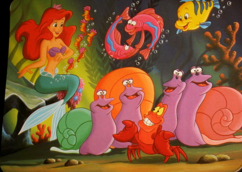
These are all lies, of course. Ariel, the mermaid, isn't even spelled "Arial". In reality, Arial was created by a team of ten designers headed by Robin Nicholas in 1982, some seven years before The Little Mermaid would reach cinema screens and an astonishing eighteen years before its sequel, The Little Mermaid 2: Back To The Sea, would find its way directly onto video cassette. Arial doesn't really have a very colorful past and it's not really a very colorful font. In fact, Nicholas himself is on record describing it as "a generic sans serif; almost a bland sans serif".

For our font hacking purposes, Arial is ideal. Firstly, its deliberately insipid letterforms make for a great blank canvas. Secondly, it is available pre-installed on most operating systems, meaning I can depend on most of you having it. Lastly, Arial itself — being based on Monotype Grotesque and infamously similar to Helvetica — is already something of a derivative typeface. This makes me feel a little less guilty about what we are about to do to it.
Hacking Arial
What You Will Need
- A text editor such as Notepad++ (FREE!)
- The SVG-based path editor, Inkscape (FREE!)
- An internet connection (ALREADY PAID FOR!)
- A mischevious imagination (FREE!)
- Arial Bold (CAME WITH YOUR COMPUTER!)
What we are going to make
Here's a further demonstration. Try typing in the box using Arial Bold's 4000+ character set. Most of the letterforms you see will belong to Arial Bold and are served from your hard disk. The others are the stencil characters we shall be manufacturing.
Note: The TTF to be created will be approximately 6.5K in size and will feature A, B, D, O, P, Q, R, a, b, d, e, g, o, p, q, 4, 6, 8, 9, 0, %, $, & and @ only. Note #2: Of course, not all devices will have Arial available. Your best bet is to put fonts similar to Arial lower down in the stack.
Legal issues?
Make no mistake: We are creating a new font to work with Arial Bold. While we are using Arial Bold to help us make new letterforms, we shall not be producing a "hacked" version of Arial that would be fit for distribution. Our stencil "font" is not a true font because it simply doesn't have enough characters to be used independently. That is, not even A to Z or a to z are covered. Meanwhile, Arial Bold itself — which supplies the remainder of the character set — is not embedded but loaded from the end user's computer in the usual way.
Step 1: Locating Arial Bold
Windows users will no doubt recall they have a C:WindowsFonts folder. If pilfering our Arial Bold TTF were as simple as delving into this folder, I could have missed this step. It's not. Thanks to permissions issues and a variety of other counterintuitive quirks regarding this folder, we're better off doing a search for "arial". On my Windows 7 machine, this unearths another folder with the memorable label of amd64_microsoft-windows-font-truetype-arial_31bf3856ad364e35_6.1.7601.17621_none_d09ba6bac4056b40, found in C:Windowswinsxs. Okay, then.
Open this folder and duplicate arialbd.ttf into a location that's within easy reach. I made a new folder called "Font Hacking" on my Desktop.
Step 2: Converting Arial to SVG
Thanks to the W3C specification's inclusion of SVG fonts, we can transform our TTF into an easily readable — and hackable — format.
There are numerous options when it comes to converting between font formats. For the GUI agnostic, FontForge enables you to do these operations via the command line. If, like me, you simply can't be bothered to install the massive package that is FontForge for a few simple tasks, there are online services like freefontconverter.com. I use this particular service frequently and have experienced no bugs to speak of.
Upload your arialbd.ttf, choose "svg" from the dropdown, hit the massive, overdesigned "convert" button and save arialbd.svg in your working directory alongside the original.

Step 3: Getting to know your SVG font
I don't expect you to read it from start to finish, but having the W3C's SVG 1.1 Fonts spec' open in a browser tab will come in handy as your font subversions become more complex. For the time being you really only need to know that an SVG font defines glyphs (letters and symbols) using the <glyph> element and that each <glyph> element has certain pertinent attributes:
glyph-namedefines a unique name for the glyphunicodedefines the character to which the letterform is mapped. This can be a standard character ("a", for example) or a hexadecimal encoding ("“" for left double quotation mark) where requiredhoriz-adv-xdefines the width of the glyph. If not set, the value is inherited from theunits-per-emattribute on the accompanying<font-face>element. This value is usually 2048 for Truetype derivationsd(data) is most important of all. It's a set of coordinates that defines the actual shape of the glyph in question
Step 4: Setting up a 'sandbox' Inkscape file
In order to change Arial's letterforms as intended, we will need to convert the <glyph>'s coordinate data into an editable Inkscape path. Fortunately, SVG's supported <path> element also takes the d attribute.
In our font hacking workflow we shall be routinely converting glyphs into paths and back again, so it helps to have a "sandbox" file to drop coordinate data into. The easiest way to set up this file is to create a new Inkscape document, draw a basic shape like a circle or square on the canvas and save it. Open this file up in your text editor and you should see a single path element with various attributes:
<path
       sodipodi:type="arc" style="fill:#000000;fill-opacity:1;fill-rule:evenodd;stroke-width:0;stroke-miterlimit:4;stroke-dasharray:none"
       id="path3012"
       sodipodi:cx="394.28571"
       sodipodi:cy="479.50504"
       sodipodi:rx="240"
       sodipodi:ry="227.14285"
       d="m 634.28571,479.50504 a 240,227.14285 0 1 1 -480,0 240,227.14285 0 1 1 480,0 z" />
For our purposes, all but the id and d attributes are cruft, so get rid of them. Now your sandbox file is ready. To create our stencil font, we shall only be required to edit characters which have fully closed counters. These are A, B, D, O, P, Q, R, a, b, d, e, g, o, p, q, 4, 6, 8, 9, 0, %, $, & and @. It would defy convention not to start with "A", so return to your arialbd.svg and search the file for unicode="A". Copy the coordinate value from this glyph's d attribute and use it to replace the equivalent d value in your sandbox file's <path>.
Step 5: Wait … what?
Upon reopening your sandbox document, you'll see that famous Arial "A" and … it's upside down. Oh.
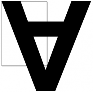
There is a reason for this and, according to at least one source, it is the ancient Periclean Greeks and their attitudes towards coordinate systems that are to blame. Finger pointing aside, the reality is that standard SVG vectors are drawn, like most image formats, from the top left, while SVG fonts are drawn from the bottom left.
We need to "correct" the orientation in our sandbox file without affecting the path itself. As luck would have it, we can utilize the transform attribute. Add transform="scale(1,-1)" as an attribute on the <path> in your sandbox file and reopen it in Inkscape. You should see something like this:
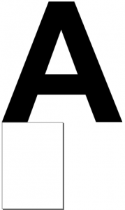
Note that the "A" now sits precisely on top of the canvas. Unnatural as it may at first seem, the top of our canvas can be safely treated as a guide for the baseline of our font. If we were to extend the letterform's shape below this line, this portion of the letterform would indeed "hang down" much like the descender of a "g" or "y". For our stencil font example, however, our path editing will be much more rudimentary.
Step 6: Removing the counter
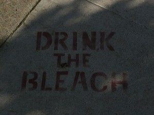
Stencils cannot have apertures because there is nothing to connect the aperture (the counter) to the rest of the stencil. Some stencil sets get around this by incorporating little bridges to connect up the pieces, as in the spray-painted slogan below:
It would be entirely possible to emulate this aesthetic now that we have the letterform in our hand. However, I don't want to get too bogged down in the finer points of Inkscape path editing. We're going to keep it simple for now and just have the counters removed altogether.
Select the "A" path by clicking on it and hit F2 to go into "edit path by nodes" mode. You should see some nodes marking the perimeter of the A's counter (the hole in the middle). Select and delete each of these so that the counter is utterly eliminated.

Save the sandbox file and reopen it in your text editor to refesh the path data. Now simply copy the value of the path's d attribute back into the d attribute of the original glyph in your arialbd.svg file. Hit save. Arialbd.svg is now the full Arial Bold font with the "A" letterform curiously lacking a counter.
Step 7: Tedious Repetition
Do for B, D, O, P, Q, R, 4, 6, 8, 9, 0, a, b, d, e, g, o, p, q, &, $, @ and % precisely what we did for "A". The results are best with just uppercase letters and you're free to just focus on these if you want to save time. To quickly recapitulate, the workflow is this:
- Locate the candidate
<glyph>by searching for theunicodeattribute value inarialbd.svg - Copy the
<glyph>'sdattribute value into thedattribute of the Inkscape sandbox's<path>in your text editor - Reopen the file with the
<path>in Inkscape, delete the counter nodes and save - Refresh the text editor version of the Inkscape sandbox SVG you just edited
- Copy the new path coordinates from the
dattribute and paste back into the<glyph>'s correspondingdattribute and resavearialbd.svg
Step 8: Converting the SVG back to TTF
Now that all of the letterforms you wanted to abuse have been abused, you'll want to convert arialbd.svg back into a TTF file. Return to freefontconverter.com, upload the SVG and choose TTF from the available options. Hit the MONOLITHIC BLUE BUTTON and save the file as arialstencil.ttf.
Step 9: Making A Webfont Kit
Those familiar with Font Squirrel's superb webfont generator will already be comfortable turning this font into a kit. However, we're going to want to base64 encode our font, which we shall be trimming down to a subset as proposed earlier. Remember: we're not going to be using a hacked Arial Bold but a new font based on Arial Bold, with Arial Bold left intact.
Upload arialstencil.ttf to the generator via the + Add Fonts button, select the expert mode using the appropriate radio control and alter the following options:
- Font formats: Just have TrueType and EOT compressed checked. EOT is for Internet Explorer and will be served via URL, not base64 encoded.
- Subsetting: Hit the "Custom Subsetting" radio. Then enter just the characters you edited into the "Single Characters" field. This is important because it will make your font much smaller and allow you to fall back to Arial in your font stack
- CSS: Check base64 encode
Finally, check the agreement and download your webfont kit.
Step 10: Embedding Your Font
Nearly there. Your new kit will contain a stylesheet.css file and an EOT font. Wherever you use your stencil font, you'll need to include the @font-face rules and place the EOT font file (for IE) relative to the stylesheet.
To make your font stack more readable, I'd rename the @font-face blocks' font-family property to something like "Stencil". Now just define your stack and include a bold font-weight. Put together, the CSS should look something like this:
@font-face {
    font-family: 'Stencil';
    src: url('stencil-webfont.eot'); /* for IE */
}

@font-face {
    font-family: 'Stencil';
    src: url(data:font/truetype;charset=utf-8;base64,AAEAAAATAQAABAAwRkZUTWbqW6UAAAE8AAAAHEdERUYAVgAEAAABWAAAACBHUE9T14HnSAAAAXgAAABQR1NVQmyRdI8AAAHIAAAAIE9TLzIP+C9XAAAB6AAAAFZjbWFwAxn38QAAAkAAAAHKY3Z0IBNoEiMAAAQMAAAARGZwZ21TtC+nAAAEUAAAAmVnYXNwAAAAEAAABrgAAAAIZ2x5ZpHWPVEAAAbAAAAOUGhlYWQBpwPsAAAVEAAAADZoaGVhEDoEzAAAFUgAAAAkaG10eKirCZUAABVsAAAApGxvY2FeQmFmAAAWEAAAAFRtYXhwAUQAxgAAFmQAAAAgbmFtZRavM7EAABaEAAABVnBvc3Q01CE+AAAX3AAAAPNwcmVwdpGPyQAAGNAAAADld2ViZqy4UTAAABm4AAAABgAAAAEAAAAAzD2izwAAAADNVlueAAAAAM1WXTcAAQAAAA4AAAAYAAAAAAACAAEAAQAoAAEABAAAAAIAAAABAAAACgAeACwAAWxhdG4ACAAEAAAAAP//AAEAAAABa2VybgAIAAAAAQAAAAEABAACAAAAAQAIAAEAEgAEAAAAAQAMAAEADP9oAAEAAQAQAAEAAAAKABwAHgABbGF0bgAIAAQAAAAA//8AAAAAAAAAAQQrArwABQAEBTMFmQAAAR4FMwWZAAAD1wBmAhIAAAILBwQCAgICAgTgACr/wAB4/wAAACkAAAAAUGZFZAAgAA3gAAZm/mYAAAhyAytgAAG/3/cAAAAAAAAAAwAAAAMAAAAcAAEAAAAAAMQAAwABAAAAHAAEAKgAAAAmACAABAAGAAAADQAmADAANAA2ADkAQgBEAFIAYgBlAGcAcSAKIC8gX+AA//8AAAAAAA0AJAAwADQANgA4AEAARABPAGEAZABnAG8gACAvIF/gAP//AAD/9f/f/9b/0//S/9H/y//K/8D/sv+x/7D/qeAb3/ffyCAoAAEAAAAAAAAAAAAAAAAAAAAAAAAAAAAAAAAAAAAAAAAAAAAAAAAAAAAAAQYAAAEAAAAAAAAAAQIAAAACAAAAAAAAAAAAAAAAAAAAAQAAAAAAAAMEBQAAAAAAAAAAAAYAAAAHAAgACQoAAAAAAAALDA0ADgAAAAAAAAAAAAAPEBESAAAAAAAAAAAAAAAAAAATFAAVFgAXAAAAAAAAABgZGgAAAAAAAAAAAAAAAAAAAAAAAAAAAAAAAAAAAAAAAAAAAAAAAAAAAAAAAAAAAAAAAAAAAAAAAAAAAAAAAAAAAAAAAAAAAAAAAAAAAAAAAAAAAAAAAAAAAAAAAAAAAAAAAAAAAAAAAAAAAAAAAAAAAAAAAAAAAAAAAAAAAAAAAAAAAAAAAAAAAAAAAAAAAAAAAAAABCYFrgD4AnwA0gDXAN0A4wDpAP0BBADLARkBEwEZASgAzQECAPoAyQDhANkArQC3AOYAkwCNAJoAsQCXAJ8AYgEfsAAssAATS7BMUFiwSnZZsAAjPxiwBitYPVlLsExQWH1ZINSwARMuGC2wASwg2rAMKy2wAixLUlhFI1khLbADLGkYILBAUFghsEBZLbAELLAGK1ghIyF6WN0bzVkbS1JYWP0b7VkbIyGwBStYsEZ2WVjdG81ZWVkYLbAFLA1cWi2wBiyxIgGIUFiwIIhcXBuwAFktsAcssSQBiFBYsECIXFwbsABZLbAILBIRIDkvLbAJLCB9sAYrWMQbzVkgsAMlSSMgsAQmSrAAUFiKZYphILAAUFg4GyEhWRuKimEgsABSWDgbISFZWRgtsAossAYrWCEQGxAhWS2wCywg0rAMKy2wDCwgL7AHK1xYICBHI0ZhaiBYIGRiOBshIVkbIVktsA0sEhEgIDkvIIogR4pGYSOKIIojSrAAUFgjsABSWLBAOBshWRsjsABQWLBAZTgbIVlZLbAOLLAGK1g91hghIRsg1opLUlggiiNJILAAVVg4GyEhWRshIVlZLbAPLCMg1iAvsAcrXFgjIFhLUxshsAFZWIqwBCZJI4ojIIpJiiNhOBshISEhWRshISEhIVktsBAsINqwEistsBEsINKwEistsBIsIC+wBytcWCAgRyNGYWqKIEcjRiNhamAgWCBkYjgbISFZGyEhWS2wEywgiiCKhyCwAyVKZCOKB7AgUFg8G8BZLbAULLMAQAFAQkIBS7gQAGMAS7gQAGMgiiCKVVggiiCKUlgjYiCwACNCG2IgsAEjQlkgsEBSWLIAIABDY0KyASABQ2NCsCBjsBllHCFZGyEhWS2wFSywAUNjI7AAQ2MjLQAAAAABAAH//wAPAAIBAAAABQAFAAADAAcAACERIRElIREhAQAEAPwgA8D8QAUA+wAgBMAAAAAAAgBG/zMEGAYwACAAIQBRAAGwIi+wBNaxCx0yMrQYEAAIBCuzFRgECCu0CBAACAQrsAgvtBUQAAgEK7ENGzIysAQQtBwOAAsEK7EjASuxBAgRErABObEYFRESsBE5ADAxEyUeARcRLgE1NDY3NTMVHgEXByYnER4BFRQGBxUjNS4BAUYBBRBYNsS3z6yRn7wa/Rdh8K7bw5Gt2AEEAZscUHQaAaM446Kk3xFjYxOzliF2Kv55Qc+itfgcu7YV2ANvAAAAAAMAWf/FBr0F0wALAA8AGwBUALIDAgArsA0ztAkEAAgEK7AZL7AMM7QTBAAIBCsBsBwvsADWtAYQAAcEK7AGELEQASu0FhAABwQrsR0BK7EGABESsQwPOTmxFhARErENDjk5ADAxEzQ2MzIWFRQGIyImCQEzCQE0NjMyFhUUBiMiJlmtlJmtrZSZrQFHAw3K/PkBxq2Wl62tlJmtBFDFvr3Gxb69/D4GC/n1AYHFvr7Fxr6+AAIAWv/aBaYF0wAiACMAOgCyHwAAK7IJAgArAbAkL7AG1rQMEAAHBCuxJQErsQwGERK0Aw8SHB8kFzkAsQkfERKyGRwjOTk5MDETNDY3LgE1NDYzMhYVFAYHEzY3Fw4BBx4BFwcmJw4BIyAnJgFaqKdLTNXFvtZqocwkGv4mOCAvlSOqfXNZyIr+7oprAfABko3hU1mhSIW5woxZoGX+80BnOod9KixpEdk9a1BMmncD9QAAAAEAVv/nBA4FwAANACcAsgsAACuyBAIAKwGwDi+wANa0BxAABwQrtAcQAAcEK7EPASsAMDETEDc2IBcWERAHBiMiAFaQdwGqeI+Qd9XW/voC1gGetpaYtP5f/mC2lgFJAAEAJgAABEQFwAAKAFQAsgkAACuyAgIAK7QHBAkCDSuxBwPpsAAyAbALL7AJ1rEIDumwAzKyCAkKK7NACAYJK7IJCAors0AJAAkrsQwBK7EICRESsAI5ALEEBxESsAE5MDETNQEzETMVIxEhESYCfOy2tv7wASf2A6P8Xvf+2QEnAAAAAAEAV//nBCoFwAAXAEoAshUAACu0DwQABwQrsgMCACuxCgnpswcVAwgrAbAYL7AA1rQSEAAHBCu0EhAABwQrsRkBKwCxDxURErEADTk5sQoHERKwBjkwMRMQADMyFhcFLgEjIgYHNjMyEhUUACMiAFcBKu6n2x7+8ApUQ1l7EGmcsPv++M/e/uICyQGTAWS7sh5UUKD9fP701OH+8AFZAAABAFP/5gQXBcAAGABAALIVAAArsgkCACsBsBkvsADWtBIQAAcEK7QSEAAHBCuzBhIACCu0DBAABwQrsRoBK7EMBhESsgMPFTk5OQAwMRM0NjcuATU0NjMyFhUUBgceARUUBCMiJyZTdn9tY+XT0edqYHp//v3XyIWdAaN3xzYuoWCk1takZp8qMbx7y/5pfAABAEH/5gQUBcAAFwBEALIJAAArsRAJ6bIDAgArtBUEAAcEKwGwGC+wANa0BhAABwQrtAYQAAcEK7EZASsAsRUQERKxDA05ObADEbEGEzk5MDETNAAzMgAREAAjIiYnJR4BMzI2NwYjIgJBAQnN3wEe/tbvrNQeARAKVEVXehFqn637A9DfARH+p/51/m7+nLe2HlNQoPx7AQsAAAABAD3+UQfGBdQAPACFALIMAAArsBEzsSIM6bIiDAors0AiGwkrsgQCACuxKgzpshgBACuwOS+0MwwAOAQrAbA9L7AA1rQuDgALBCuwLhCxFAErtB8QAAcEK7AfELEnASu0CA4ACwQrsT4BK7EfFBEStAwEGyo5JBc5sCcRsBw5ALEYOREStggADxonLjUkFzkwMRMQACQhMgQSFRQHAiEiJicGIyImNTQ3NjMyFzchAwYVFBYzMjc2EjU0ACEgBAIVFBIXFgQkNwYHBiEgJAI9AQoBzgEp/AGIz53F/sxTVA52mqbbhKD6slUZAQiXDhcQMExmfv6c/sH+8f6Hv9XA2gHrAdCpZM/t/qv+tv4g6gHjARkB5fPE/pfW/87+/Do4cuW+68LsiG/9M0QUGRk6TAEAifYBS93+b9nT/qZQTAmKhstzhN8BswAAAAEAAAAABb8FugAHACEAsgAAACuwAzOyAQIAKwGwCC+xCQErALEBABESsAU5MDExASEBIQMhAwI7ATkCS/6+gP22eQW6+kYBTf6zAAABAJYAAAViBboAEwA4ALIAAAArsgECACsBsBQvsADWtA0QAAcEK7QNEAAHBCu0BxAABwQrsRUBK7EHABESsQoTOTkAMDEzESEyHgIVFAYHHgEVFA4BBwYFlgJKrquHWm9fhpBdoXZK/uUFuh1cmV9nrCsnvH9kvXENCAIAAQCUAAAFYQW6ABAAJwCyAAAAK7IBAgArAbARL7AA1rQIEAAHBCu0CBAABwQrsRIBKwAwMTMRITIXHgESFRQHBgcGBwYjlAIdt2CBuGAtN2ZNg2KkBbocJsL+5861g6BjSyofAAEAWf/nBecF0wAPACcAsg0AACuyBwIAKwGwEC+wANa0ChAABwQrtAoQAAcEK7ERASsAMDETNDc+ATc2MyAAERAAISAAWUMyrWeJswFEAYX+fv69/rn+fgLU4Jhwsis6/m7+mv6d/m8BjwAAAAEAlQAABPgFugAPACsAsgAAACuyAQIAKwGwEC+wANa0BxAABwQrsQ8Q6bQHEAAHBCuxEQErADAxMxEhIBceARUUDgEHBisBEZUB2wEOUn6qYpdOasnBBboWId2vh7hpERX91wABAFn/bQYeBdMAFQA0ALITAAArsgMCACsBsBYvsADWtAYQAAcEK7EXASuxBgARErEKDTk5ALEDExESsQwROTkwMRMQACEgABEUBwYHFhcHJicmJwYjIABZAYABSQFGAX41KFhtgG1DQA63kK/+rv6BAt0BZwGP/nH+mb6QbmdOLtEUIwd7PwGOAAAAAAEAlgAABbwFugAVADkAsgAAACuwDTOyAQIAKwGwFi+wANaxFRDptAYQAAcEK7EXASuxBhURErEJDjk5ALEBABESsBM5MDEzESEyHgEVFAYHHgEXEyEDLgIrARGWAm/r1YDCwWB9arP+ntZyVF5mPAW6T8qCpdccOIar/uIBP6tZIf2cAAEASf/oBC4EPgAjAFMAshoAACuwITOyEQEAK7EKBukBsCQvsADWtBYQAAcEK7AWELEGDumwBi+xJQErsQYAERKyDhEhOTk5sBYRsRoeOTkAsQoaERK0AA0OFR4kFzkwMRM0PgE3Njc1NCYjIgYHJz4BMzIeARUDFBYXISYnJicOASMiJklWm5LFTFBvS1Qa/yvSz7y4SwMbJf7qCxAHA0ikXaS9ASJajUscJSAcUUU7Si6alFmJt/64jIVMHDcZCEZGsgABAIf/6ASUBboADwBLALIAAAArsAszsgECACuyBQEAKwGwEC+wANa0CBAABwQrtAgQAAcEK7EPDumxAw3psREBK7EIAxESsAs5ALEFABESsgMIDjk5OTAxMxEhETYzMhIREAAjIiYnFYcBGYKywv7+/blbsUAFuv3wlP7n/vn+8P7aW1mcAAAAAQBU/+gEYQW6AA8AVwCyCQAAK7ANM7IGAgArsgMBACsBsBAvsADWtAgQAAcEK7QIEAAHBCuwCBCxBQ3psAUvsAgQsQkO6bAJL7ERASuxBQARErANOQCxAwkRErIABQo5OTkwMRMQEjMyFxEhESE1DgEjIgBU/sKyggEZ/vtBsVq3/vsCFwEOARmUAhD6RpxbWQEnAAEAQf/oBCEEPgAXAEAAshQAACuxDQXpsgMBACuxCgTpAbAYL7AA1rEKDemyCgAKK7NACgkJK7EZASsAsQoNERKxEBE5ObADEbAAOTAxExAAMzIXFhEUFSEeATMyNjcFDgEjICcmQQEU0+2Jg/1AA4JhQloXARg26a/+64VpAgsBCAErnJb+0Q0OfYtIUC+aobWRAAABAFT+UQRgBD4AIwBlALIgAAArsgYBACuwAzOwDS+xFwbpAbAkL7AA1rQIEAAHBCu0CBAABwQrsAgQsR0N6bAdL7AIELEFDumwBS+xJQErsR0AERKyAw0QOTk5ALEgFxESsRASOTmwBhGyAAUeOTk5MDETEAAzMhc1IREUDgIjICY1NDcFFhcWMzI3Njc2PQEGIyInJlQBAb/FgAEHPnC7j/7y4gEBQQgdKFZuNyUTDX7A1n1iAhkBCwEarZX8R7y6ajy5jg4UJzgVHiEWMSNem6y1jwAAAAABAFL/6ASaBD4ADQAnALIKAAArsgQBACsBsA4vsADWtAcQAAcEK7QHEAAHBCuxDwErADAxEzQSNjMyABUUACMiJAJSiv2c8QE0/snskv73igIijAEGiv7H7/H+w4QA/wABAIv+bASXBD4AEABJALIMAAArsgEBACuwBjOwAC8BsBEvsADWtAkQAAcEK7EQDemxAw7ptAkQAAcEK7ESASuxCRARErAGOQCxAQwRErIDCQ85OTkwMRMRIRU+ATMyABEQACMiJicRiwEGM65quQEC/vy5WI9P/mwFupxQZP7e/v3+9v7ZRlX96QAAAAEAW/5sBGIEPgARAFsAsg4AACuyBwEAK7ADM7AKLwGwEi+wANa0CBAABwQrsAgQsQoN6bAKL7AIELQAEAAHBCuwAC+wCBCxBg7psAYvsRMBK7EKABESsAM5ALEHDhESsgAGCzk5OTAxExAAMzIWFzUhESERDgEjIicmWwEDwGqbPAED/uc3pF+1dYoCHwEAAR9aW536RgIWR1OInwAAAAABAAAAAAQkBCQAAwAAMREhEQQkBCT73AABAAAAAQAA789BlV8PPPUAHwgAAAAAAM1WXTcAAAAAzVZdNwAA/lEHxgYwAAEACAACAAAAAAAAAAEAAAhy/NUAAAfNAAAAAAfGAAEAAAAAAAAAAAAAAAAAAAApBgABAAAAAAACqgAABHMARgcdAFkFxwBaBHMAVgRzACYEcwBXBHMAUwRzAEEHzQA9BccAAAXHAJYFxwCUBjkAWQVWAJUGOQBZBccAlgRzAEkE4wCHBOMAVARzAEEE4wBUBOMAUgTjAIsE4wBbAxgAAAYwAAADGAAABjAAAAIQAAABjAAAAQgAAAEIAAAAxgAAATwAAABYAAABPAAAAYwAAAQkAAAAAAAWABYAFgB4ANIBLAFcAZ4B7gI2AoQDKgNQA44DwAP2BCgEbgSwBRIFVgWgBeoGVgaGBswHHAccBxwHHAccBxwHHAccBxwHHAccBxwHHAccBygAAQAAACkAPQADAAAAAAACAAEAAgAWAAABAACFAAAAAAAAAAgAZgADAAEECQABAAoAAAADAAEECQACAAwACgADAAEECQADAE4AFgADAAEECQAEABgAZAADAAEECQAFABYAfAADAAEECQAGABgAkgADAAEECQDIABYAqgADAAEECQDJADAAwABBAHIAaQBhAGwAQgBvAGwAZABNAFQARgBvAG4AdABGAG8AcgBnAGUAIAAyAC4AMAAgADoAIABBAHIAaQBhAGwALQBCAG8AbABkAE0AVAAgADoAIAAxAC0AMwAtADIAMAAxADMAQQByAGkAYQBsACAAQgBvAGwAZABNAFQAVgBlAHIAcwBpAG8AbgAgADEALgAwAEEAcgBpAGEAbAAtAEIAbwBsAGQATQBUAFcAZQBiAGYAbwBuAHQAIAAxAC4AMABGAHIAaQAgAE0AYQByACAAIAAxACAAMAA4ADoAMgA3ADoAMQA5ACAAMgAwADEAMwAAAAIAAAAAAAD/JwDXAAAAAAAAAAAAAAAAAAAAAAAAAAAAKQAAAQIBAwAHAAgACQATABcAGQAbABwAIwAkACUAJwAyADMANAA1AEQARQBHAEgASgBSAFMAVAEEAQUBBgEHAQgBCQEKAQsBDAENAQ4BDwEQAREGZ2x5cGgxB3VuaTAwMEQHdW5pMjAwMAd1bmkyMDAxB3VuaTIwMDIHdW5pMjAwMwd1bmkyMDA0B3VuaTIwMDUHdW5pMjAwNgd1bmkyMDA3B3VuaTIwMDgHdW5pMjAwOQd1bmkyMDBBB3VuaTIwMkYHdW5pMjA1Rgd1bmlFMDAwALgB/4WwAY0AS7AIUFixAQGOWbFGBitYIbAQWUuwFFJYIbCAWR2wBitcWACwAyBFsAMrRLAEIEWyAwcCK7ADK0SwBSBFsgQHAiuwAytEsAYgRbIF5QIrsAMrRLAHIEWyBmYCK7ADK0SwCCBFsgdJAiuwAytEsAkgRbIINQIrsAMrRLAKIEWyCSECK7ADK0SwCyBFsgoYAiuwAytEsAwgRbILHAIrsAMrRAGwDSBFsAMrRLAOIEWyDboCK7EDRnYrRLAPIEW6AA1//wACK7EDRnYrRLAQIEWyD1MCK7EDRnYrRFmwFCsAAAAAAVEwrLcAAA==) format('truetype');
    font-weight: normal;
    font-style: normal;
}

.your-selector {
   font-family: 'Stencil', arial, sans-serif;
   font-weight: bold;
}
Oh go on then, add some text-shadow:
Ambition Is A Virtue
As I have already stated, the "stencil font" example is relatively basic. It doesn't really even change the letterforms' shapes as such. More ambitious permutations you could try might involve breaching the baseline (as already discussed), or narrowing/extending the glyph width (being careful to adjust the horiz-adv-x attribute accordingly). It should be noted that, in my experiments, converting from SVG to TTF using online tools have resulted in a loss of kerning data. However, values for kerning can be found inscribed in Arial Bold's many, many h-kern elements.
<hkern u1="A" u2="y" k="76" />
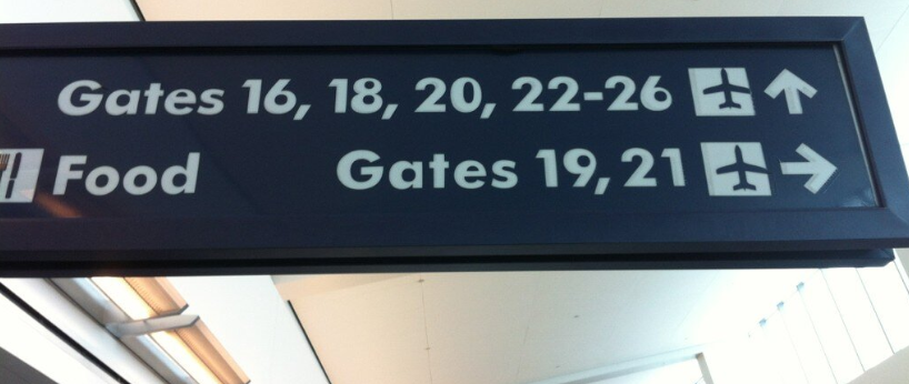
Arguably, the most fun is to be had making only the subtlest of changes. Popular fonts have familiar, well-established personalities so even the slightest subversion could have a potentially dramatic effect on their reception. Take James Grieshaber's photo of misprinted signage at Buffalo Niagara International Airport, below. The slightly misplaced counters have instilled an accidental exuberance into a previously po-faced geometric sans:
Conclusion
I've always found more creative satisfaction in deconstructing things as opposed to constructing them; more mileage in reconfiguring than configuring. I think the reason is that starting from scratch feels like starting from within and simply purging my private, isolated ideas into the world always felt a bit pointless. This is probably why I'm drawn to Dadaist photomontage and why I've spent countless hours of my life obsessively sourcing and sequencing audio samples. I enjoy being able to turn mere consumables (adverts, songs, fonts, images) into my own cultural objects. I get a kick out of transforming diktat into dialogue, engaging with what's already out there and forcing it to engage with me.
If you share my inclinations, perhaps you'd care to outline your font hacking ideas in the comments. Alternatively, you can reach me on Twitter (@heydonworks). Even if your subversions don't yield production-suitable typography, I hope you'll gain a better appreciation of some of the most iconic and pervasive shapes known to the worlds of design and culture.